How Print Room Matches Colours for Screen Printing and Embroidery: A Guide to Ensuring Your Brand Stays On Point
When it comes to custom merchandise, colour accuracy is critical for maintaining your brand’s identity. At Print Room, we understand how important it is to get your colours just right—whether it’s matching your logo’s shade for screen printing or finding the closest embroidery thread for your design.
To ensure the best results, we use the Pantone Coated Colour Matching System for screen printing and Madeira Rayon Classic threads for embroidery. While Pantone matching is highly precise for printing, embroidery threads sometimes don’t have an exact match. That’s where our expertise comes in: we’ll guide you through the process of selecting the best colour options for your project.
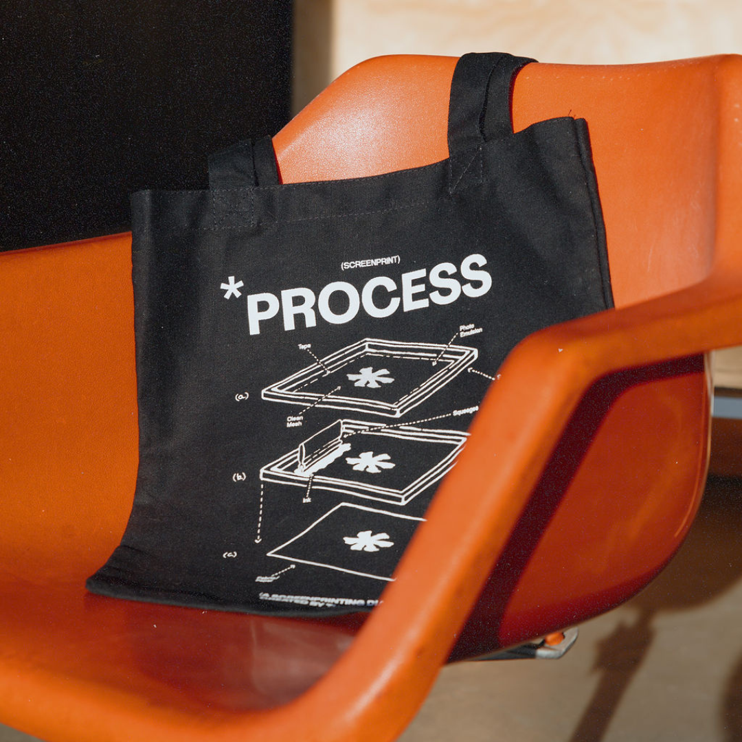
The Pantone Coated Matching System for Screen Printing
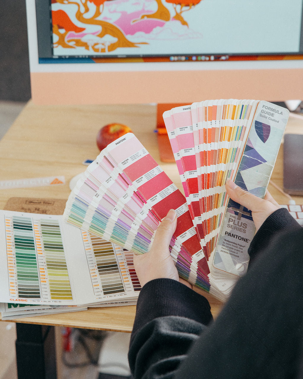
What Is the Pantone Matching System (PMS)?
The Pantone Matching System is a universal colour-matching system used across various industries to ensure colour consistency. Each colour is assigned a unique code, eliminating the guesswork when matching shades across different materials or production methods.
At Print Room, we use the Pantone Coated System for screen printing. This allows us to custom mix our inks to match your brand colours exactly.
How We Match Pantone Colours for Screen Printing
- Send Us Your Brand’s Pantone Colours: If your brand guidelines include Pantone Coated codes (e.g., Pantone 185 C), share them with us.
- Custom Ink Mixing: Our production team carefully mixes inks to match your specific Pantone colour.
- Test Prints: Before printing your full order, we test the ink on fabric to ensure the colour matches your expectations.
Why Use Pantone Matching?
- Consistency: Your brand colours will remain consistent across all printed items.
- Versatility: The same Pantone colour can be used across multiple projects, ensuring brand alignment.
-
Professional Results: Custom-mixed inks ensure vibrant and accurate prints every time.

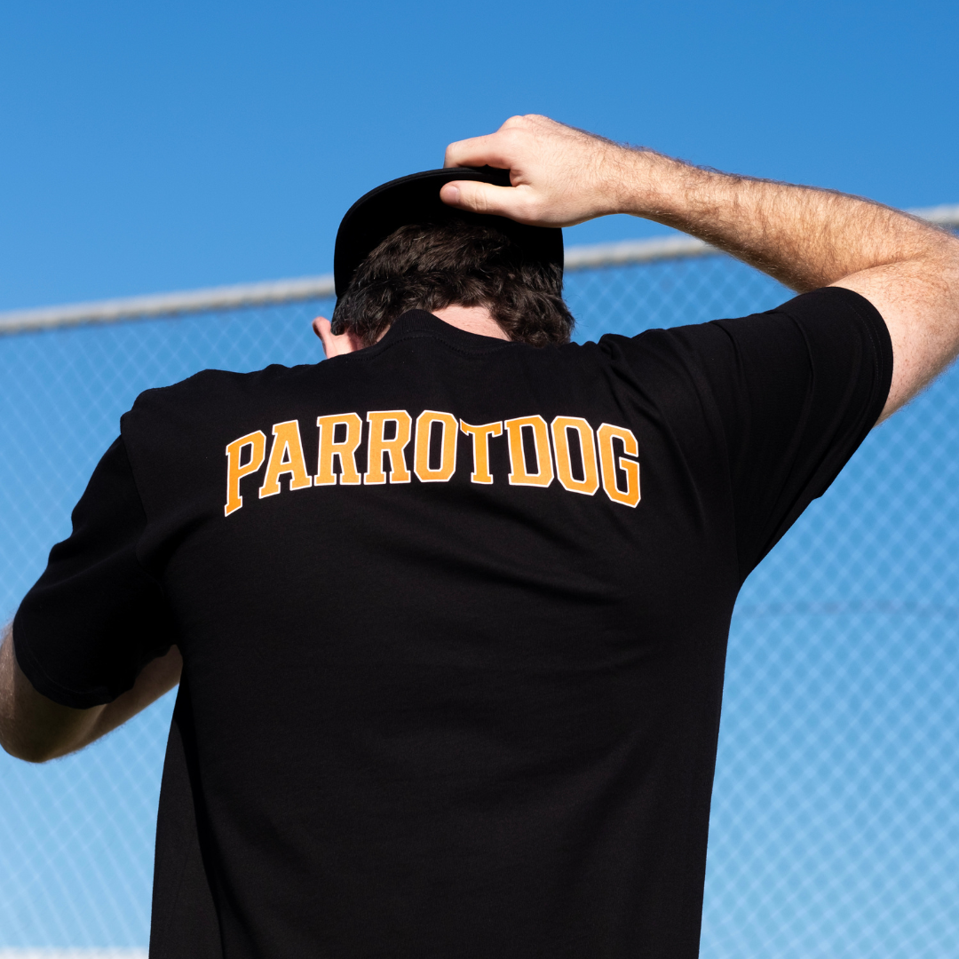
Matching Colours for Embroidery
For embroidery, we use Madeira Rayon Classic thread, a high-quality thread known for its durability and colour vibrancy. Many of Madeira’s thread colours are matched to Pantone Coated colours, but due to the nature of thread materials, an exact match isn’t always possible.
Why Aren’t All Thread Colours an Exact Match?
Embroidery threads are made from rayon, which reflects light differently than printed ink. This can make some colours appear slightly different when compared to their Pantone equivalents. Additionally, not all Pantone Coated colours are available as thread colours.

How We Choose the Best Embroidery Thread for Your Design
- Pantone to Thread Matching: If your brand has a Pantone colour, we’ll match it to the closest Madeira thread colour.
- Expert Selection: When no exact match is available, our account managers use their expertise to choose the nearest thread colour that aligns with your brand.
- Approval Process: If needed, we’ll share samples or swatches of the selected threads to ensure you’re happy with the final result.

What Happens When There’s No Exact Match?
In cases where a perfect match isn’t possible—for example, specific shades like metallics or neons—we’ll guide you through the options:
- Adjusting the Design: Slightly modifying the colour scheme to use available thread colours.
- Combining Methods: Using screen printing for areas that require perfect Pantone matches and embroidery for other parts of the design.
-
Collaborating on Decisions: Our team will communicate with you every step of the way to ensure the final product aligns with your expectations.
Why Trust Print Room for Colour Matching?
At Print Room, we’re committed to delivering high-quality custom merchandise that reflects your brand perfectly. Here’s why you can count on us:
- Expertise in Colour Matching: Our team has extensive experience in matching Pantone colours and selecting the best embroidery threads to ensure brand consistency.
- Attention to Detail: We test and review colours before production to ensure the final product meets our high standards.
- Customised Solutions: Whether it’s screen printing or embroidery, we’ll recommend the best method to achieve the most accurate colour results for your project.

Tips for Clients: How to Help Us Match Your Colours
To ensure the best results, here’s what you can do:
For Screen Printing
- Provide your Pantone Coated colour codes (e.g., Pantone 186 C).
- If you don’t have Pantone codes, share a high-quality example of your logo or branding, and we’ll help identify the closest match.

For Embroidery
- Let us know if you have flexibility with thread colours, especially for shades that may not have an exact match.
- If you’re unsure about the colour, request a thread sample to review before production.
Common Questions About Colour Matching
1. Can You Match Colours Without Pantone Codes?
Yes! If you don’t have Pantone codes, we can still match colours based on your logo or design. However, using Pantone codes ensures the highest accuracy.
2. What If My Colours Look Different on Fabric?
Colours can appear slightly different depending on the fabric type and thread material. We account for these differences during production and work with you to ensure satisfaction.
3. Can I See Samples Before Printing?
Absolutely! We can provide test prints or embroidery swatches for review, especially for large orders or critical projects.

Let Us Help You Get the Perfect Match
At Print Room, we understand that colour accuracy is crucial to your brand. Whether you’re creating screen-printed t-shirts or embroidered merchandise, our team is here to ensure your colours are as close to perfect as possible.
Ready to get started? Contact us today to discuss your project, or request a free sample pack to see our quality in person. Let’s bring your vision to life with perfectly matched colours and stunning results!